


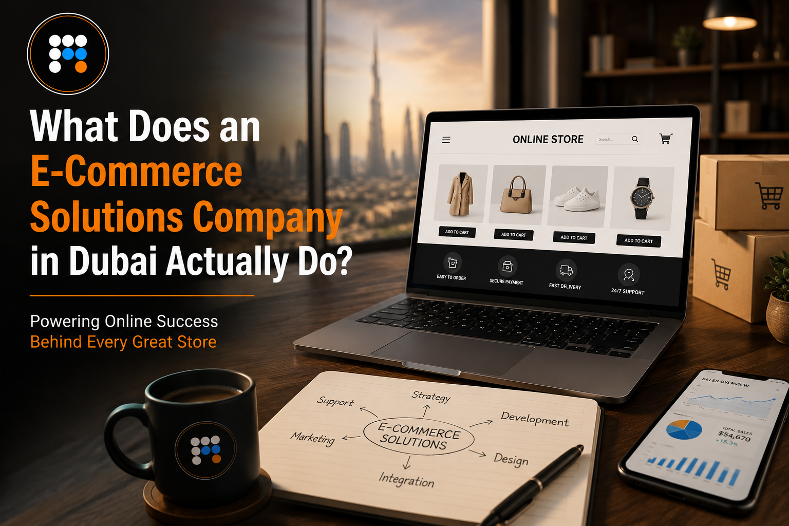
Most business owners hear the term e-commerce solutions company and assume it simply means someone who builds online stores. That is part of it, but it is a small part. The businesses that succeed online in Dubai are not the ones that just got a store built. They are the ones that had a partner thinking about platform choice, user experience, local payment behavior, logistics, and performance all at once, before a single product page went live.
If you are trying to figure out what you are actually paying for when you hire an e-commerce solutions company in Dubai, here is the honest breakdown.
A Quick Answer for Busy Readers
An e-commerce solutions company in Dubai handles platform selection, store design, payment gateway integration, logistics setup, and ongoing performance optimisation. The goal is not just a working store but one built around how UAE shoppers actually browse, pay, and expect delivery to work, with continuous improvements after launch rather than a one-time handoff.
Platform Selection - Shopify, WooCommerce, Magento and When Each Makes Sense
The first real decision in any e-commerce project is the platform, and this is where a lot of businesses get steered wrong by whoever happens to specialize in one option.
Shopify development in Dubai tends to make sense for businesses that want to launch quickly, do not need deeply custom backend logic, and prefer a hosted environment where infrastructure is handled for them. It is a strong fit for product-based businesses with standard catalog needs and a desire to get to market without managing servers.
WooCommerce development company engagements usually suit businesses already running on WordPress for their content, or those who want full ownership of their hosting environment and more flexibility to customize functionality without platform restrictions. It costs less to start but requires more technical oversight over time.
Magento sits at the more complex end. It fits larger catalogs, multi-store setups, and businesses with specific B2B pricing or inventory logic that smaller platforms cannot handle cleanly. It is rarely the right starting point for a new business, but it becomes necessary once volume and complexity outgrow simpler platforms.
A genuine e-commerce solutions company will walk you through this decision based on your catalog size, growth plans, and budget rather than defaulting to whatever they are most comfortable building.
Store Design and User Experience for UAE Shoppers
Design decisions that work in one market do not always translate to another, and the UAE has its own shopping behavior worth understanding.
Mobile usage here is extremely high, so a store that performs beautifully on desktop but loads slowly on mobile data is losing sales before a visitor even sees a product. Bilingual support, Arabic and English, often needs to be built in from the start rather than added later, since retrofitting a site for right-to-left text layouts after launch is far more expensive than designing for it upfront.
Trust signals also matter more here than in some other regions. Visible delivery timelines, clear return policies, and recognizable local payment options on the checkout page all influence whether someone completes a purchase or abandons their cart. Online store development UAE projects that ignore these details often see strong traffic numbers paired with disappointing conversion rates, and the gap between those two numbers is usually where the real problem lives.
Payment Gateways and Logistics Integration in the UAE Market
This is the part of e-commerce that gets the least attention in generic guides but causes the most operational headaches when it is done poorly.
Payment gateway integration in the UAE needs to account for the mix of payment behaviors here. Cash on delivery still accounts for a meaningful share of online purchases in this region, alongside card payments and increasingly digital wallets. A store that only supports international card processors without local payment rails will quietly turn away a portion of potential customers who simply do not see a payment method they trust.
Logistics integration matters just as much. Connecting your store to local courier services, generating accurate shipping costs at checkout, and giving customers real tracking visibility are not nice extras, they are baseline expectations now. A proper e-commerce website development UAE project accounts for this from the technical architecture stage, not as something bolted on after the store is already built.
This is also where many businesses realize their existing setup is holding them back. If you have noticed shipping costs are calculated manually, inventory syncing between channels requires spreadsheets, or your payment provider cannot support the methods your customers actually want, those are often early signs you've outgrown your tech setup, and worth addressing before they cost you more sales.
Ongoing Maintenance, Speed, and Conversion Optimisation
Launch day is not the finish line, even though a lot of businesses treat it that way. A store that loads in two seconds today can slow down within months as product catalogs grow, apps get added, and traffic increases. Page speed directly affects both conversion rates and search rankings, so ongoing performance monitoring is not optional if you want the store to keep performing.
Conversion optimisation is the other half of this. Small adjustments, checkout flow simplification, abandoned cart recovery, product page layout testing, often produce bigger revenue gains than another round of paid advertising. A capable e-commerce solutions company in Dubai treats this as continuous work rather than a project that ends at launch.
Conclusion
An e-commerce company in Dubai is not just a vendor who builds you a store and disappears. The work spans platform strategy, design decisions shaped by local shopping behavior, payment and logistics integration specific to this market, and the ongoing optimisation that keeps a store performing well after launch.
If your current setup is already showing strain, whether that is manual workarounds, missing payment options, or a platform that cannot keep up with where your business is heading, it is worth getting a proper assessment before those gaps start costing you customers. Fixels Media has spent years helping UAE businesses build and grow their online stores the right way. If you want to talk through what your business actually needs, get in touch with our e-commerce solutions team, and we will put together a clear plan.